How to reference titles in the header or footer

How do you repeat the title of each chapter in the header or footer of your document? If dividing the document into sections, unlink them and edit the sections manually one by one is your answer, this little article is worth reading.

If you’ve formatted your document with styles, the solution is not to use sections but the field Stylereference . This is easy and is furthermore an automatic way to create headers or footers which differ from each other in this area.

Suppose the title of each chapter is formatted with the style Heading 1, this is how you do it:

  1. Double click in the header or the footer and position your cursor where you want to reference the text
  2. The contextual tab Header and Footer Tools appears, click on the dropdown menu Quick parts > Field…
  3. In the dialog box Field, choose Links and References from the list Categories, select StyleRef from the list Field names list and Heading 1 from the list Style name.
  4. Make sure that the Preserve formatting during updates box is checked and click OK
  5. The text of heading 1 appears in the header or footer and varies depending on the current chapter.

styleref

I always start a new chapter on a new page, in this way a chapter never ends and begins on the same page. You can set this by formatting the paragraph of the style > Line and Page Breaks > Page break before.

You can use Styleref for each style you’ve used. You can, for example, mention the title of your document in the footer on the left hand page and the title of the chapter in the footer on the right hand page or separate them by an underscore or another symbol in the same footer.

Note that a lot of built-in cover pages of MS Word (you can find them under the tab Insert > dropdown menu Cover Page) contain content controls that are inserted in text boxes. If you like to reference such content control in the header/footer of you doc, you’ll first have to remove it from it’s text box, otherwise it won’t work.

There you have it, another advantage of formatting a text document with styles!

Based on Word 2016

How to make a tri-fold in MS Word

A lot of informational or promotional brochures are made in-house, often by an office, communication or business manager and often in MS Office. Although MS Publisher is the most appropriate application of the MS Office Suite to design a brochure, I explain in this article how to do the job in MS Word. For the reason that most office workers are more familiar with MS Word, also because the wordprocessor uses styles, which are a great help when it comes down to formatting textual content and simply because it is possible!

Starting from a blank (A4) document, this is how you make a trifold.


Go to the tab (Page) Layout, group Page Setup and adjust the following things:
Change the Page Orientation into Landscape.
Open the dropdown menu Margins and choose Narrow
(=1,27 cm or 0.5 inch for Top, Bottom, Left and Right margin)
Open the dropdown menu Columns > More Columns…the dialog box Columns opens.


The Number of columns depends on the desired number of folds: choose two columns if you want to make a bi-fold and three columns if you want to make a tri-fold. Since this article is about tri-folds I choose Three.

The distance between the columns has to be twice the space of the Margins. So if you have margins of 1,27 cm or 0.5 inch the Spacing has to be 2,54 cm or 1 inch.

As a trifold has 3 equal-size panels on each side it is important that the option Equal column Width is checked.

Check also Line between so you can see the fold line between the different columns or panels of the tri-fold. When you’re done with formatting and ready to print, you can uncheck this option again.

Click on OK

Now the document has the settings of a trifold, you can start designing. But which content belongs where? It is difficult to imagine the end result when looking at the blank pages on your screen. So, I advise to take a piece of paper, fold it as a trifold and number each panel to the order in which you would open it. The video below is a guideline.


Thus, the document is to be formatted as follows:

Tips to design your trifold further:

  • Activate your Show/Hide marks (tab Home, group Paragraph)
  • Add column breaks to ensure that each panel of your trifold contains information that stands by itself and makes sense (tab Page Layout, dropdown menu Breaks)
  • Like always, use the color palette and the fonts that are associated with the brand of your organisation. Hey, what did you think? ;)
  • Use Styles to format headings, standard text, list paragraph, quotes,… this is after all one of the advantages of working in MS Word. You can create a new style set or reuse a style set of a previous brochure (on condition that it is consistent with the corporate identity). Go to the tab Design and Save as a New Style Set… or choose a Custom Style Set.
  • Be creative! Change the background colour, insert several similar shapes and fill it with pictures, highlight special text in coloured text boxes/callouts, put one big picture behind the text of panel 2, 4 and 5 or panel 2 and 3 (as suggested in the video),… whatever you do, try to fit all elements within the look and feel of your organisation

On Pinterest you can find lots of examples to inspire you!

I’ve made a basic template for my colleagues of Howest to get started, containing styles and with the right Theme Fonts and Theme Colours. All content is adjustable.

Howest_template trifold
Howest_template trifold 2

And this is an example of a tri-fold I’ve made with the template, it’s in Dutch.

Howest_voorbeeld trifold

Howest_voorbeeld trifold 2


How to format your Excelsheet and improve your productivity

These days it’s all about christmas lights and glühwein, but for many it’s also the end of the fiscal year. And sadly, that means that we are faced with many figures, calculations and formulas. Besides the glühwein this complex data might make your head spin, especially when the info is poorly presented. Time to clear your mind and your doc!

In this article I’ll explain how to display data in an Excel worksheet and which formatting can be set automatically.

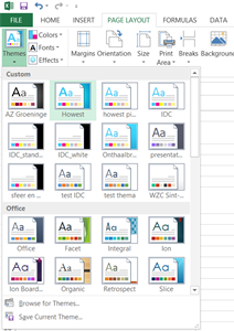
The first step to a clear and professional looking worksheet starts, like always, with the theme. Change the theme of the default template into the customized one (that you’ve made) of your organisation (to do so: go to tab Page Layout > dropdown menu Themes > your theme). The corporate fonts and colours are now integrated in the file and also, content like shapes, tables, charts,… that you have inserted or will insert will be based on that specific theme.

Further formatting depends on the kind of information you would like to format:

How to format text into a worksheet
Don’t start each line of text at the beginning of a new row.
It is frustrating to do and confusing for co-workers who want to edit the text but don’t know which cell they have to adjust.


each line of text starts at column A: A4, A5 and A6. The cells next to A4, A5 and A6 are empty.

Don’t resize a cell either to insert all text. That one big cell will be a pain to format the rest of your content. Instead, make it easy on yourself and enter (a) paragraph(s) of text in a text box. Also, in this way you have more functionality at your disposal (text and paragraph editing tools)

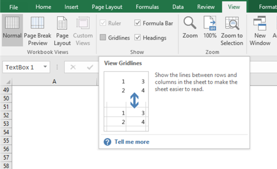
If you don’t like the look of the text box of which the outlines do not cover the cells perfectly, you can uncheck the Gridlines on the tab View. But it’s better to do this after you’ve done with formatting, cause they are quite handy when it comes to Ranges of cells and Tables.

How to format typical Excel content like a cell, a range of cells, tables and charts

Cells
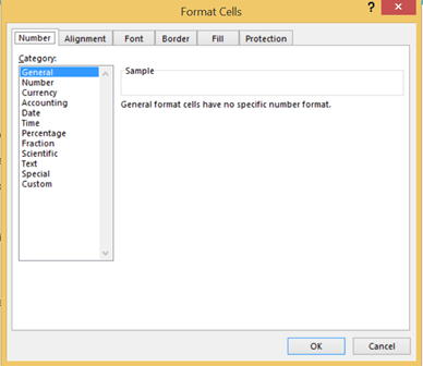
The most popular commands are displayed on the tab Home.  For more options, right click on the cell and choose ‘Format Cells…’, you can format Number, Alignment, Font, Border, Fill and lock or hide cells.

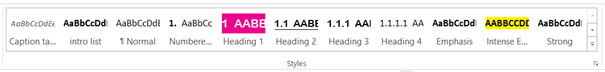
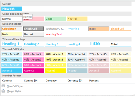
But it would take a long time to format each cell manually. For different sorts of content you can use cell styles or set a New Cell Style… (tab Home). If you use these cell styles consistently you’ll obtain a well structured worksheet that enables you to identify the following information at first glance: Good, Bad and Neutral / Data and Model / Titles and Headings /… there are also Themed Cell Styles and each style can be modified.


Tables

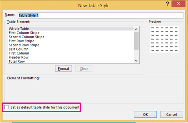
You can quickly change the look of a table via Table Styles on the contextual tab Table Tools. These are based on the theme of the document, but if these don’t fulfil your needs, you can also create a New Table Style. Click on the dropdown menu Table Styles > New Table Style… Unlike Styles in Word, it is not possible to copy the direct formatting of a table straight away to create a new table style. You can set the New Table Style as default table style for the document.

A Range (of cells)
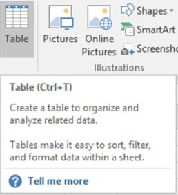
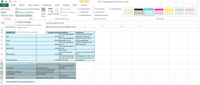
As you can format a table quickly via Table Styles, it is clever to convert your range of cells into a table, give it the right formatting, i.e. table style and convert it back again to a Range. The formatting of the table will be maintained. This workaround might save you quite some time!
To convert a range into a table: select the cells, click on the tab Home > Format as Table or on the tab Insert > Table. To convert it back again to a range, click on Convert to Range on the contextual tab Table Tools.

Tip: Unlike the cells of a table, you can merge cells of a range (tab Home > dropdown menu Merge & Center) If you want to merge cells of a range, first give it the right formatting (by converting it into a table, choose a table style and convert it back again to a range, see above) If you convert a range with merged cells into a table you’re asking for trouble!

Header 1 Header 2 Header 3
Cell Cell Cell

Merged cell

Cell
Cell Cell Cell

Range with a merged cell

Header 1 Header 2 Header 3
Cell Cell Cell

Merged cells

Cell
Cell Cell Cell

After converting the range with the merged cell into a table: the merged cell is unmerged.

Header 1 Header 2 Header 3
Cell Cell Cell

Merged cells

Cell
Cell Cell Cell

After converting the table into a range again: the formatting of the table is preserved, but the merged cell stays unmerged.

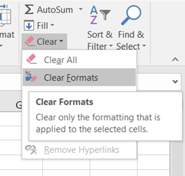
Tip: If you want to clear the formatting of a Table or a Range, click on the dropdown menu Clear on the tab Home and choose Clear Formats.


Charts
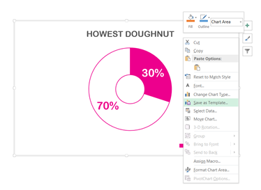
The same for tables goes for charts: they are based on the theme of the document, but you can also adjust a chart and save it as a template.

Before you unpack your christmas gifts don’t forget to pack the workbook as an Excel template: go to the tab File > Save As > Save as type: Excel Template (.xtlx). Now you have a template which you can reuse year after year, you just have to open it as a normal Excel Workbook (.xlsx) and replace the content.

If you want to print the workbook, take a look at the Page Break Preview on the tab View to see how your file will be printed.

Happy holidays!

How to convert an old presentation into a corporate template

The introduction of an unique Howest template raises the question of how the staff of Howest can apply this template to an existing presentation. How smooth the conversion goes depends on a few crucial factors, just like it did with the conversion of the slide size in my previous post. And also in this story, the pre-set layouts of the Slide master are playing a major role. This proves again how important they are in terms of creating a presentation.


The slide sorter gives an overview of all the possible slide layouts of the Howest template with aspect ratio 4:3

Open the template (like the 3:4 template of Howest in the picture above) that you like to use. Import the slides from an old presentation into this template via the tab Home > drop-down menu of the command New slide > the option Reuse Slides…

On the right, the window Reuse Slides appears. Locate the slides that you want to insert, either from a slide library or from a PowerPoint file.

window reuse slides

Make sure the option Keep source formatting (below the window) is ticked off before you right click on one of the slide thumbnails in the right window and select Insert All Slides.


The result after inserting all slides into the template, not quite what I had in mind…

How your presentation looks like now and in which degree the result corresponds to the layouts of the template all depends on how your old presentation was created.

If in the old presentation no layouts (or associated placeholders) of the Master View were used, you will have to transfer the content of each slide manually to a proper layout of the template.

But if your slides in Normal view are based on the layouts of the Slide master, the conversion will go more automatic. Though, you’ll still need to verify each slide and you will probably need to make quite a few minor adjustments or choose a better layout for a slide.

To change the layout of an imported slide: Click right on a slide and choose Layout. The selected layout is the current one. You change this just by selecting another one (of the desired template).


The last 5 layouts don’t belong to the original template.

Besides being patient, the best thing to do is to compare each slide in both presentations (the old one with the new one) via the Tab View > Arrange All.

Again, if you have a better workaround, feel free to share!

How to resize your presentation

As promised, a sequel to the article of last week about the slide aspect ratio 4:3 and 16:9.

Most likely you will convert 4:3 format into 16:9 rather than vice versa, as widescreen has become the new standard (the 4:3 screen format of iPad is an exception) and the same goes for slides.  Anyway, this blog post covers the conversion in both directions. In the article I assume that the presentation you would like to resize, is created in a template and pictures and text are inserted in placeholders.

Is this a story with a happy ending?  Well, it depends on a few factors…

There are different methods of resizing your presentation. One option is to resize your presentation via the tab Design, Slide Size. Another way is to copy all the slides from the original presentation and paste them into a new presentation which has the desired aspect ratio (Choose past option Keep Source Formatting)
Which path you take, does not really matter. Just make sure you work with a copy of the original presentation, because the original might come in handy in the future!


After converting a widescreen into a 4:3 format, the photo looks distorted.

At this point all the graphics or logos in your slides will be out of proportion (Scale Height and Scale Width will be dissimilar). They will look either stretched or distorted. To fix this, select all the slides (to do so: select the first slide, hold the shift key and select the last slide) and click on Reset on the tab Home, this command resets the position, size and formatting of the slide placeholders to their default settings. So thanks to the feature Reset pictures get their normal proportions back. But you are not out of the woods yet, because there is also a drawback to this feature.

Using the pre-set layouts of the Master View is one thing concerning formatting slides, but not the only one. Often, there has been also a lot of “direct formatting” in Normal view. A few examples to clarify what I mean: pictures you’ve positioned via the crop tool in the placeholder, font colour you’ve changed, words you’ve made bold, new layouts you’ve created because the layout you are looking for was not foreseen in the template,… The Reset feature takes no account of these kind of adjustments in Normal View. They just get lost after clicking Reset. 

    
After converting a widescreen into a 4:3 format and clicking on Reset, the photo looks okay, must be repositioned in the placeholder again.

If you know for sure you haven’t done a lot of this “direct formatting”, the story ends well for you (checking the font size and indentation is the only thing left to do, because they might have changed after conversion).

But it can be quite frustrating if you’ve made a lot of these little changes in the Normal view and time consuming to restore everything to the way it was before… As an alternative you can leave the Reset feature for what it is and Crop > Fill each picture via the contextual tab Picture tools which appear after selecting a picture.

crop and fill

Converting slides often takes a long time. If you know a  more efficient way or a magical button to convert slides without losing any direct formatting AND with respect to the aspect ratio of the pictures, please share and make my day!

Look before you leap!

Before you start designing a new presentation, you do well to ask yourself what slide format you need to give your public an optimal viewing experience. Should your slides have 4:3 or 16:9 aspect ratio to make full use of the projection screen? PowerPoint does not help you which format to choose, it opens a new presentation automatically in widescreen format. So be aware!

The standard output on monitors and screens used to be 4:3. Now the format of most screens is 16:9 or widescreen. PowerPoint has gone through the same evolution, as since 2010 the default dimensions of new presentations are 16:9 (although the slide size 4:3 is still called ‘Standard’ in PowerPoint)

Forewarned is forearmed, but sometimes you do not  know in advance which kind of screen will be used. If you’ve made the wrong choice and made a widescreen presentation that you have to display on a 4:3 projector screen or vice versa, your slides will not fill the entire screen. Either horizontally or vertically you’re will lose a part of your projection space. The black bars in the pictures underneath illustrate this.


So the worst case scenario is not too bad! But try to avoid it if you can.
Of course, you can convert your presentation into the right format, but this can cost you a great deal of time. In a future article I’ll tell you how to fix this.

Icons made by http://www.freepik.com from http://www.flaticon.com is licensed under http://creativecommons.org/licenses/by/3.0

Get rid of boring Word docs!

In the beautiful brochures – which are made by the communication department of Howest in the Adobe suite – text is sometimes surrounded by coloured frames. It is one of the ingredients for a fresh Howest look.


Luckily, this types of style elements are not exclusive to the Adobe suite. You can perfectly integrate them in MS Word to spice up long, dull documents. Though the method of working in Word may differ from the one in Adobe and is not always so obvious.

Take the coloured frames for example, you may think – just as I thought – to integrate them via the feature Text Box on the tab Insert. This is okay for normal text, but I noticed that text boxes do not work for numbering like in multilevel styles and footnotes. If you put such “special” text in a text box, the numbering of the list is no longer correct.

A solution to integrate this element without losing the numbering? Insert a
Rectangle (tab Insert > shapes) instead of a Text Box, give it a lively colour and put it behind the text via the feature Send Backward > Send Behind Text on the contextual tab Drawing Tools.

The document above is made in Word. Besides little style elements like the coloured frames, the page number in little triangles, the text balloons, … the document catch the eye by using a lot of colour and contrast!

By integrating these little style elements you are one step closer to a fun and readable document!

Shapes versus placeholders: the crucial differences

In the view Slide Master of PowerPoint, you can insert both text boxes as text placeholders. Both seem the same at first sight, but when you return to the normal view of your presentation differences become cleary noticeable. This post highlights the differences between text boxes and text placeholders or, in a wider context, between shapes and placeholders.

Even if you’ve never heard of Placeholders before, you are probably more familiar with them then you might think. Take the first slide of a new presentation for example. It contains two frames in which you can enter text according to the instructions, but which you also can delete, resize, colour,…. These flexible frames look like text boxes but are in fact Text Placeholders.

If you go to the Slide Master and scroll through the different layouts you’ll notice that there are -in addition to frames for text- also frames for pictures, charts, tables, SmartArt, Media, Online pictures or content in general. These are all placeholders.
If you make your own template, you can insert these placeholders by the feature Insert Placeholder on the tab Slide Master.

Besides placeholders, you can also insert shapes (including text boxes) in the Slide Master view. But unlike the first, shapes cannot be adjusted in the normal view. If you insert for example a blue text box in the Master view and return to the view Normal, you will notice that this is a fixed element on the slide which is impossible to select, and thus impossible to adjust.

There is also a second difference between placeholders and shapes: a placeholder can be put on the back or foreground on the slide whereas a shape will always remain in the background when you insert them into the slide master.

However, both shapes and placeholders are useful when it comes down to making a PowerPoint template. How to use these two elements correctly is for a future post.

Based on PowerPoint 2016.

The mystery of the option ‘Resize shape to fit text’

There are a few issues with the PowerPoint template of Howest that both users and I would like to see resolved. Now they cause confusion and lead to an inconsistent Howest look (and most likely we are not the only one with this issue).

Difficulties arise in two specific situations: when users switch the layout of a slide or use the feature ‘Reset’ in normal view. In both situations pink placeholders with the Slide Master settings ‘resize shape to fit text’ are involved.

The Slide master slides contain instructions for the user.

The first time you enter text in such pink bar (in normal view) the size of the bar corresponds to the length of the text. Settings go into effect as you would expect.

But when you use the feature Reset the pink bars take over the bar size of the Slide Master. Although the setting ‘resize shape to fit text’ is checked, the size of the bars do not longer correspond to the length of the text.


The feature Reset “resets the position, size, and formatting of the slide placeholders to their default settings”. This is taken very literally if you click on Reset.

The same happens when you change the layout of a slide with a pink banner via the feature Layout on the tab Home.

To get this right, you briefly need to check another option (for example ‘Shrink text on overflow’) before checking the option ‘resize shape to fit text’ again.

No wonder that this workaround confuses users…

Based on MS Office 2016

How to number your heading styles

To set the numbering of your headings, you might think you have to modify the numbering IN the headings of the style gallery on the home tab.


Though styles is not the place to be if you have more than one heading, because then you need to set up a list with different levels, and not just a basic numbered list.

The only way to do this – as far as I know – is by the function ‘Multilevel List’ on the home tab. Select a heading and click on ‘Define new multilevel list…’ in the drop-down menu. Then click on ‘more’. Now you can link each level to a style, or more specifically, to a heading style.
So link level 1 to heading 1, level 2 to heading 2, leaving 3 to heading 3,…


Besides that, you can adjust the Number format.

  • Do not forget to restart each list after the previous heading/level, for example: the numbering of heading 3 has to restart after heading 2.
  • The more levels you have, the larger the text indent has to be so that all the text of the headings is aligned neatly underneath each other, like the first example below.


The headings in the styles gallery should now be numbered but you can turn the numbering on or off by clicking on the function ‘Numbering’ on the home tab.

Based on MS Office 2013