You don’t have to be blessed with, as the Germans say, a fingerspitzengefühl for design to create professional-looking documents. The secret lies in a few basic rules that everyone – with a little bit of effort – can master. Today I discuss one of them: alignment.
Alignment unifies separate elements on a slide or a page. This principle visually organizes the information and shows how items are in one way or another connected to each other.
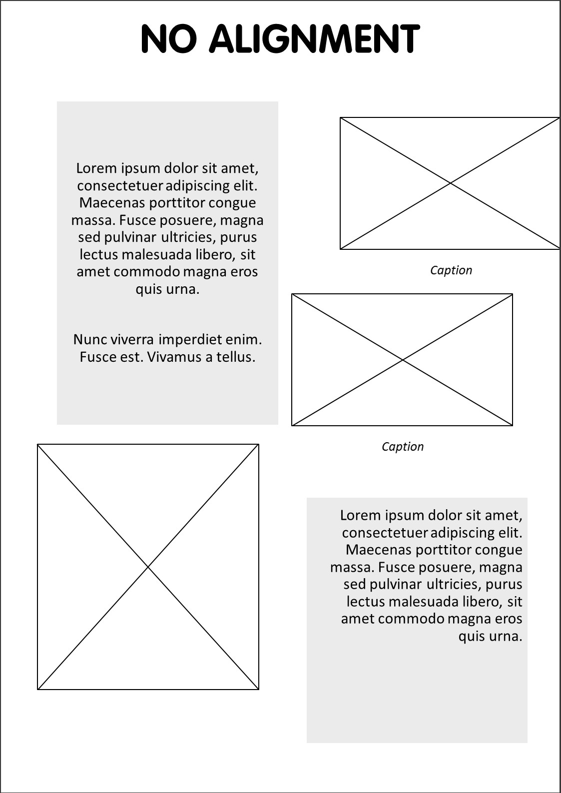 This is an extreme example of a poster with no alignment at all. Title, pictures and text blocks are arbitrarily placed on the page and parts that are closely related to each other are differently aligned. The text is aligned in three different ways: left, right and centered. This is practically a felony in the world of graphic design ;) More common is to choose one type of alignment that you repeat throughout the page. Besides that, centered text is generally not a good idea for professional documents, especially for body text, cause this makes reading more difficult. The poorly arranged poster creates a messy look and confuses the spectator.
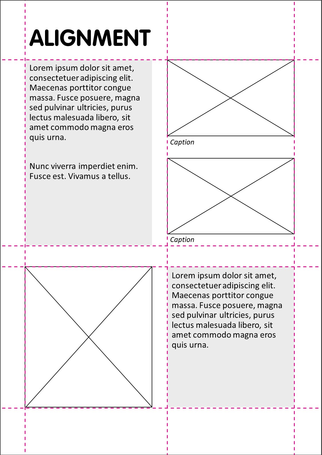
This is the same poster after applying alignment. By following this easy principle the poster looks more elegant and professional. Each item has a visual connection to another item on the page. Note that the elements are not only vertically, but also horizontally aligned, along a baseline.
Try to align consequently. Use for example the same white space between different elements.
As said before, try to avoid centered alignment, this is not as strong as left or right alignment, and creates a less serious look.
How to align in MS Office
Both in PowerPoint and Word you can align selected objects relative to one another. Furthermore, you can align an element to the edge of the slide in PowerPoint, or in Word, to the edge of the page or margin. In PowerPoint you can snap objects to a grid but unfortunately, the option to align objects to drawing guides is missing. Depending on this choice you can check further alignment options: align left, center, right; align top, middle, bottom; distribute horizontally or vertically.
You can find the different align options on the contextual tab Drawing Tools > group Arrange > dropdown menu Align. On the tab Home in the group paragraph you can find the options to align text.
Robin Williams (namesake of the actor) discusses the principle of alignment together with other interesting design tricks in her book The Non-Designer’s Design Book, a must read!
For instance, she advices to combine alignment with the principle of proximity, which implies that you adjust the spacing between the items according to their relationship to each other. This results in good compositions.
Hope this leads to better and clear lay-outs for your future documents and maybe an extra book on your bookshelf!
