How to number your slides

Sometimes it’s handy to have slide numbers to refer to. How to number your slides is fairly easy so I’ll keep it short and simple!

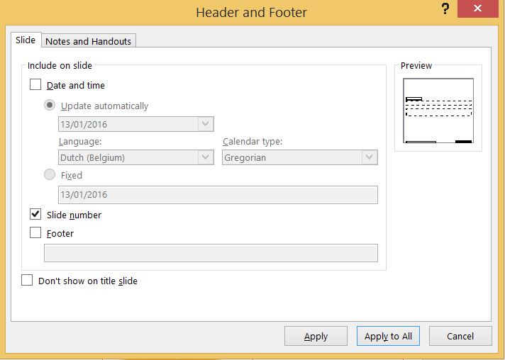
Go to the tab Insert and click on the command Slide Number in the group Text. The dialog box Header and Footer opens. Tick Slide number and choose Apply or Apply to All et voilà, a slide number appears on the slide(s).

dialog box header and footer


Troubleshooting
If this does not work, you will have to change some settings in the Slide Master View.
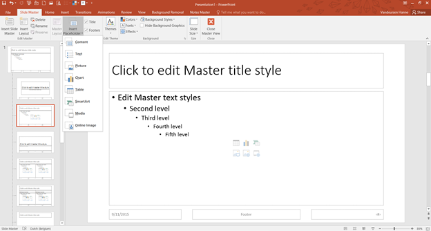
Go to the tab View and click on the command Slide Master. The first larger slide in the slide thumbnail pane on the right is the Master Layout. This slide controls the associated layouts underneath and is the key to a lot of settings and automatisms, like slide numbers.

Screenshot master layout
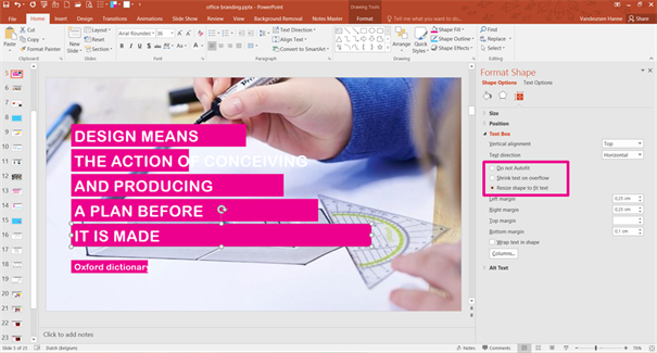
Click on the command Master Layout on the tab Slide Master and tick the placeholder Slide Number > OK. Now the Master Layout has the # sign which you can format and position as you want (take the look and feel of your organisation into account).

Master Layout


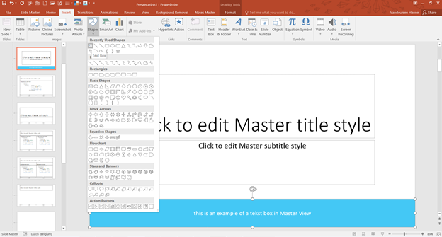
Each layout positioned beneath the Master Layout has Title and Footers (i.e. date, slide number and footer) as default placeholders. You can tick these placeholders’ checkboxes on or off on the tab Slide Master. So if the slide number does not show up after you’ve adjusted the Master Layout, tick Footers (which include slide number) for each associated layout.
show or hide the footer placeholder

As of now you shouldn’t have any issues displaying slide numbers in normal view. Close the master view, go to the tab Insert and click on the command Slide Number in the group Text. Tick Slide number and choose Apply or Apply to All.

Shapes versus placeholders: the crucial differences

In the view Slide Master of PowerPoint, you can insert both text boxes as text placeholders. Both seem the same at first sight, but when you return to the normal view of your presentation differences become cleary noticeable. This post highlights the differences between text boxes and text placeholders or, in a wider context, between shapes and placeholders.

Even if you’ve never heard of Placeholders before, you are probably more familiar with them then you might think. Take the first slide of a new presentation for example. It contains two frames in which you can enter text according to the instructions, but which you also can delete, resize, colour,…. These flexible frames look like text boxes but are in fact Text Placeholders.

If you go to the Slide Master and scroll through the different layouts you’ll notice that there are -in addition to frames for text- also frames for pictures, charts, tables, SmartArt, Media, Online pictures or content in general. These are all placeholders.
If you make your own template, you can insert these placeholders by the feature Insert Placeholder on the tab Slide Master.

Besides placeholders, you can also insert shapes (including text boxes) in the Slide Master view. But unlike the first, shapes cannot be adjusted in the normal view. If you insert for example a blue text box in the Master view and return to the view Normal, you will notice that this is a fixed element on the slide which is impossible to select, and thus impossible to adjust.

There is also a second difference between placeholders and shapes: a placeholder can be put on the back or foreground on the slide whereas a shape will always remain in the background when you insert them into the slide master.

However, both shapes and placeholders are useful when it comes down to making a PowerPoint template. How to use these two elements correctly is for a future post.

Based on PowerPoint 2016.

The mystery of the option ‘Resize shape to fit text’

There are a few issues with the PowerPoint template of Howest that both users and I would like to see resolved. Now they cause confusion and lead to an inconsistent Howest look (and most likely we are not the only one with this issue).

Difficulties arise in two specific situations: when users switch the layout of a slide or use the feature ‘Reset’ in normal view. In both situations pink placeholders with the Slide Master settings ‘resize shape to fit text’ are involved.

The Slide master slides contain instructions for the user.

The first time you enter text in such pink bar (in normal view) the size of the bar corresponds to the length of the text. Settings go into effect as you would expect.

But when you use the feature Reset the pink bars take over the bar size of the Slide Master. Although the setting ‘resize shape to fit text’ is checked, the size of the bars do not longer correspond to the length of the text.


The feature Reset “resets the position, size, and formatting of the slide placeholders to their default settings”. This is taken very literally if you click on Reset.

The same happens when you change the layout of a slide with a pink banner via the feature Layout on the tab Home.

To get this right, you briefly need to check another option (for example ‘Shrink text on overflow’) before checking the option ‘resize shape to fit text’ again.

No wonder that this workaround confuses users…

Based on MS Office 2016

How to make coloured headings: PowerPoint versus Word

One of the most striking elements of the corporate identity of Howest University College West Flanders are the pink (magenta) text bars, as you can see in the folder below.

The layout of this folder is made by the communication department in the Adobe suite. But what about MS Office? In other words, how can lecturers of Howest implement this style element in a presentation or in their course material? I tried it out in PowerPoint and Word!

This post seems very much focussed on the branding of Howest, but similar headings are very popular in the world of graphic design. I collected a few examples on Pinterest.

In Word this style element can be introduced as a heading that you can add to the styles gallery if desired. Select the text of your heading and click on Shading on the tab Home. Choose the colour of the shading. (For your convenience you can install the corporate colours as theme colours, so you don’t have to set the RGB values of your corporate colours each and every time.)

Depending on whether you only select the text or the entire paragraph, this is the result:

HERE ONLY TEXT IS SELECTED
HERE THE ENTIRE PARAGRAPH IS SELECTED


In PowerPoint this style element can be used as the title of the presentation, to emphasize the central idea of each slide, to present a quote,… But unlike Word the feature Shading is not available for text in PowerPoint (if I am mistaken please correct me!) Also different from Word is that text in PowerPoint is always inserted in a text box or a placeholder (slide master)… So the way to achieve the same look is by colouring this boxes with the function Shape fill on the tab Home or the contextual tab ‘Drawing tools’. Resize shape to fit text ensures that the pink box corresponds to the length of the text (to do so: right click of the mouse on shape, format shape, size and properties, text box).

This is the result in PowerPoint:

If you take a look closer and compare the end result of the two methods, you can notice a tiny difference between the pink bars in Word and the ones in PowerPoint: the headings in Word look more cut off than the text boxes or placeholders in PowerPoint. This is because text boxes or placeholders have a left, right, top and bottom margin of which you can adjust the spacing. This does not seem possible via the feature Shading in Word.


Of course, it is also possible to introduce the pink bars as a text box with margins in Word, but since Word is a word processing program it is more logical to implement this style element as a heading style in the Styles gallery.

Based on MS Office 2013